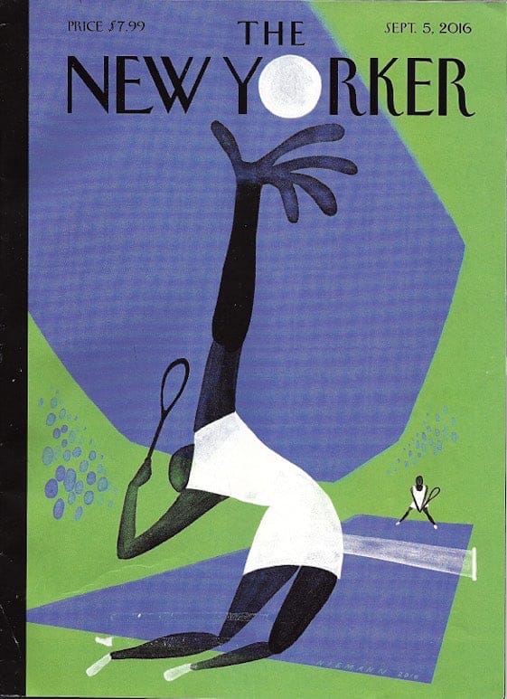
The current New Yorker cover illustration by Christoph Niemann brought back a tingling rush of pleasure for those long summer days during graduate school when I played more than my fair share of tennis.
The body’s arc of contraposto just before letting loose the serve, the ball tossed to the exact point in space where the racquet would soon hit. The illustration is a master class in graphic design. Minimum of shapes and colors. The long reach of the arm almost pushing through the magazine cover. The beautiful expanse of sky blue, echoed by a gathering of blue ovals to suggest the crowds watching the U.S. Open. I can feel the heat and the tension of the game. The crowning achievement of this delicious image is the placement of the tennis ball—exactly on the spot of the “O” in “YORKER.” A slam dunk for the eyes!
You can watch an animated version of this illustration—or you can get out on the court and play!


